BEAU 220 — Final Presentation · Fall 2024
Beyond Rare
A new fragrance concept under Rare Beauty — full brand and packaging development, from positioning and persona through 3D bottle renderings, primary and secondary concepts, and white-model deliverables.
- Product Development
- Packaging
- Brand Strategy
- Fragrance
The brief
Design a new beauty product under an existing parent brand — full concept, brand alignment, persona, packaging, and final deliverables (primary white silhouette, secondary white model, full-color comp). I designed a fragrance line for Rare Beauty, Selena Gomez’s clean, cruelty-free cosmetics brand, and named it Beyond Rare.
The parent brand
Rare Beauty launched in September 2020 with a clear point of view: encourage positivity to yourself and others. I benchmarked it against Kosas, Saie, and Tower 28 — the cleanest set of competitors — and found that none of them had a fragrance. There’s a real whitespace for a fragrance that carries Rare Beauty’s confidence-and-self-love message into a new category.
The persona
The target spans men and women, 15–35. The shared values: uniqueness, simplicity, cruelty-free formulation, and confidence. Aesthetic markers: clean, elegant, minimalist packaging; enhancing inner beauty rather than masking it; product quality that justifies the price.
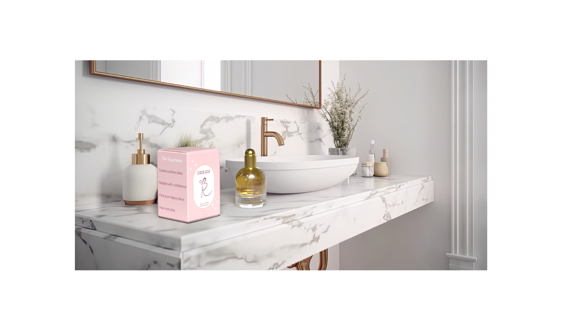
The positioning
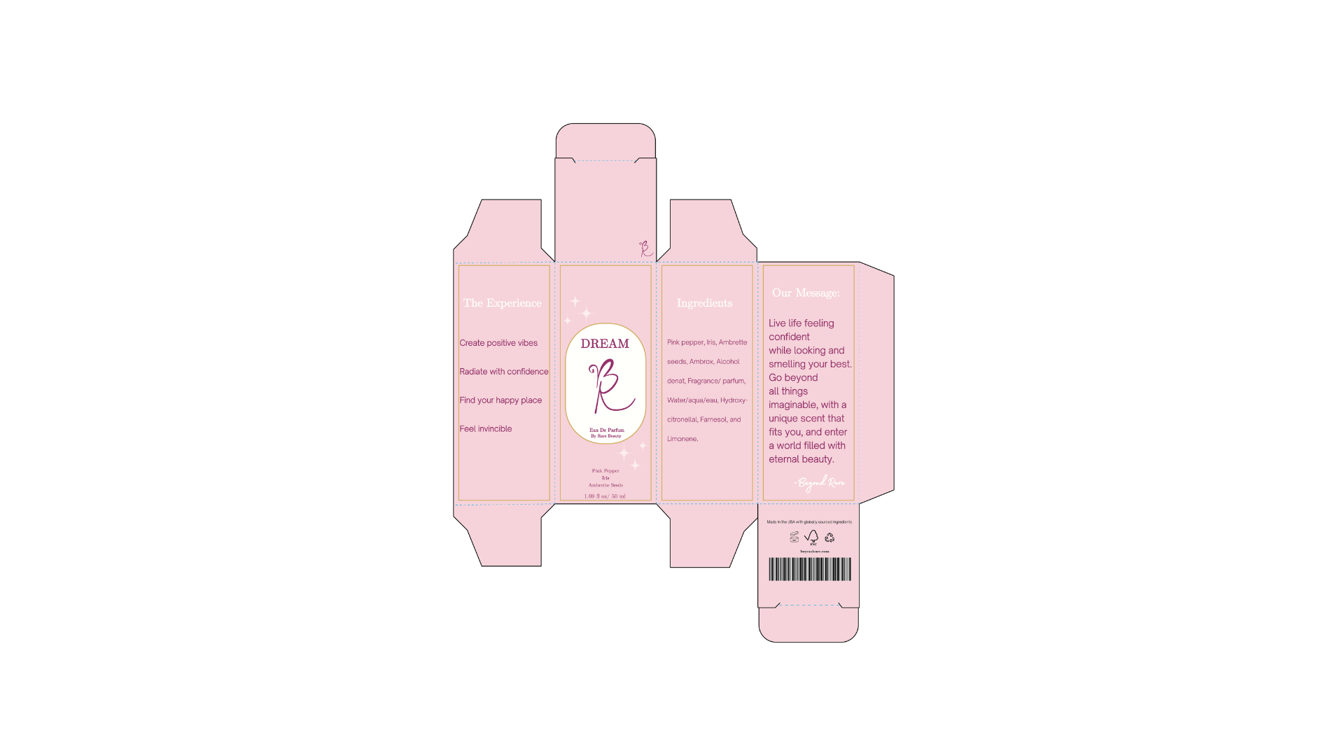
Beyond Rare: Live life feeling confident while looking and smelling your best. Go beyond all things imaginable, with a unique scent that fits you, and enter a world filled with eternal beauty.
I worked the name backward into the substantiation: Beyond — surpassing, above. Rare — unique, special, one-of-a-kind. The brand promise: breaking social norms by becoming a more confident version of yourself.
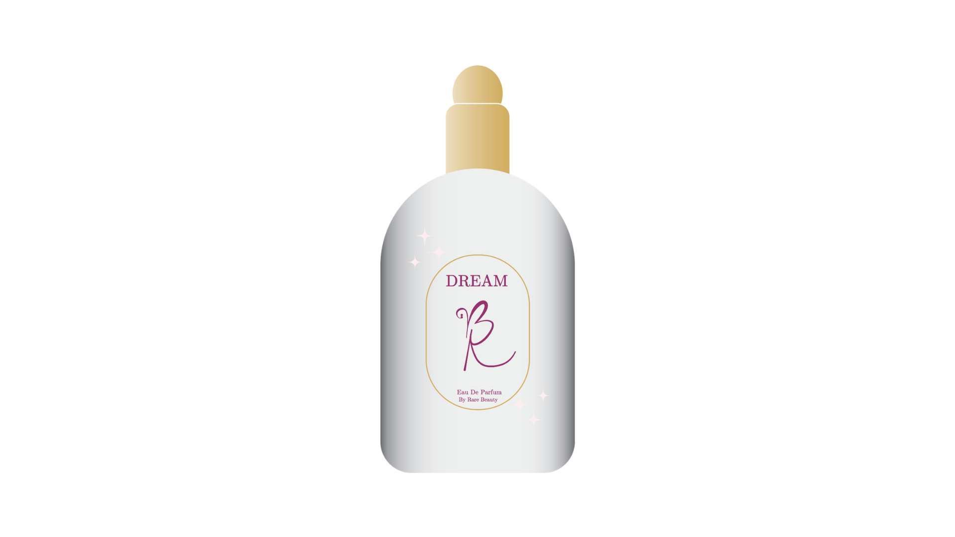
The product format
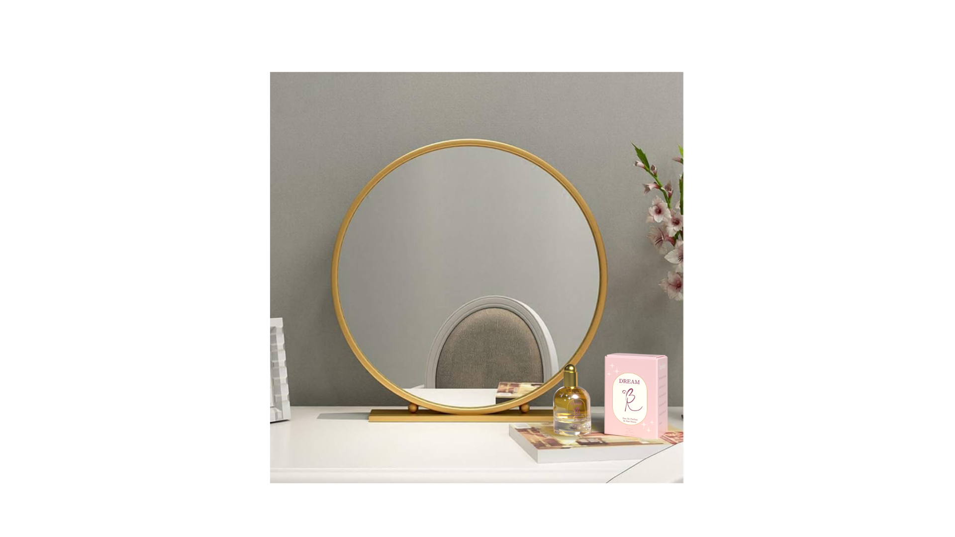
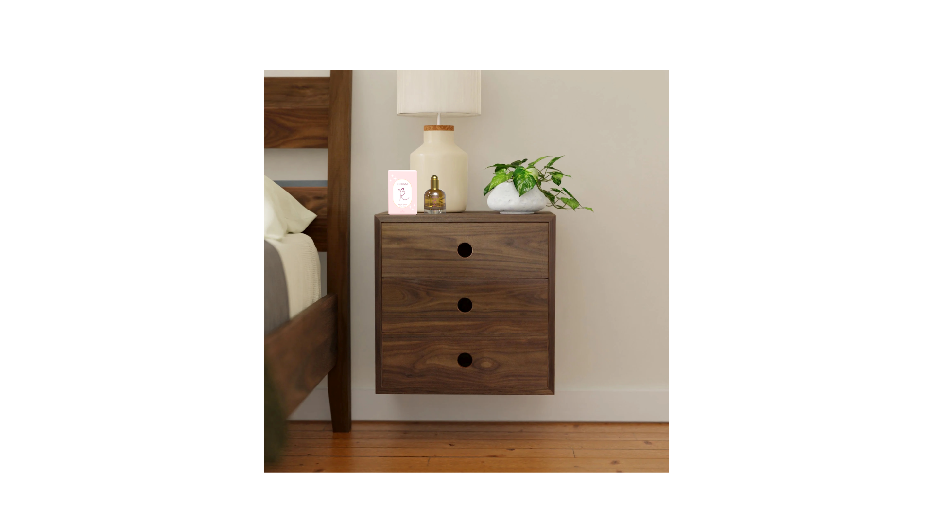
Eau de Parfum — the highest concentration of fragrance essential oils — in a glass bottle with a metal accent. I worked through size, weight, and material tradeoffs against the goal: a luxurious feeling at an affordable price point. Three SKU sizes (1.0, 1.7, 3.4 oz), durability-tested form, cost-effective enough to ladder into Rare Beauty’s existing $20–30 product tier without breaking the brand’s accessibility promise.
The design
Color attributes: cream for calmness, elegance, simplicity; pink for love, nurture, compassion. Together they read as warm, soft, hopeful — emotionally adjacent to Rare Beauty’s existing visual language without copying it. Form attributes: a glass body, a plastic cap, and a measured proportion system that scales cleanly across the SKU sizes.
The marks
I developed primary and secondary logo concepts at three scaled sizes — for cap embossing, bottle face, and outer box. The primary mark anchors the bottle silhouette; the secondary serves the box and the campaign extensions. Both carry through to the 3D renderings and final white models.
Deliverables
A primary white foam-core silhouette, a secondary white card-stock model, and a full-color secondary comp — the three artifacts the final crit was graded on. All three are pictured in the gallery.
Gallery
Selected pages